Learn about the GrabCAD Platform
Get to know GrabCAD as an open software platform for Additive Manufacturing
Visit our new homepage
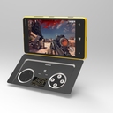
We saw many good game controller concepts, but this one stood out. This looks like it is right out of our design lab. Christopher did a fantastic job capturing the brand's style in his design. The extensions to the phone's features are intuitive and practical. It's integrated look with the phone and nice, curvy shell make it look so sleek. Each time I look at it, I like it more.
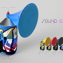
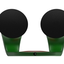
This was our favorite speaker entry thanks to attention to detail and branding. The speakers appear seamless - they look like they're almost an original part of the phone. The design is simple and pure and there was a compelling use as it seems like something people who love and use.
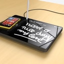
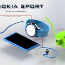
We love think adding an accessory that could add functionality for special populations is a really good idea. It uses wireless charging and a touch user interface (UI) to give anyone with eyesight issues, dexterity trouble, or other special needs easier access to icons and commands. The product design is clean and minimal, which matched the Nokia Lumia styling. We like that the graphical UI becomes the main focus when the product is active. And we forgive Kiwano for misspelling "Lumnia" :)
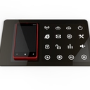
Neat media center idea and the minimalist design definitely matches up with our brand! We aren't sure how users would use the storage option but enjoy the multi-functionality of this hub. We appreciated the detail that only the functions that need user interaction are designed to be visible like the charging area and SD card slot.
This very fun and over-the-top style was too good to leave off the list. Perhaps a good companion at sports events, but maybe not as good of a brand fit as the top choices. It still shows the fun colors and vibrant nature of the Nokia Lumia brand.
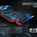
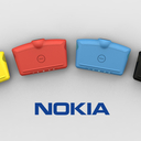
This design targets more serious gaming but was lacking the Nokia style. Good job with the analysis of the N-gage and addressing the expressed issues. Product surface treatments brought to a usually conservative product category (game controllers)!
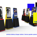
We added this originally overlooked gem because it matches the fun styling of Nokia but also adds a new realm of functionality. Wirelessly charging multiple devices with a close, but not quite there Nokia style makes Duje's entry worthy of a prize.
This is what the Nokia Lumia looks like while charging at work (or enjoying a movie, or a game). We originally didn't include this design as a finalist and think it is worth including because of its all-inclusive design and usefulness. It wasn't as good as incorporating the colors and brand as the top entries but we love the hidden remote and screen.
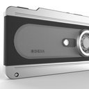
Realistic and minimalistic extension of the current Nokia accessories, but a little too retro styling to place in the top entries. We did appreciate the very fresh element layout!
If hipsters ran Nokia, they would build this accessory :) On a more serious note, it nicely integrated with the existing phone controls and adds real benefit to the phone features. Again, we really liked it but it didn't place as highly since it was more retro than Nokia design.
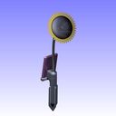
Nice variation on the solar charger idea. It supports the consumer's day to day routines and is a good fit for those with "green fingers." We thought there were other options that incorporated useful ideas with the Nokia brand, but still wanted to mention the inventiveness of this entry.
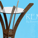
We aren't sure how the Remi would charge devices but like the out of the box thinking by including furniture into the mix.
 Carla Eid
 Kaspar Kiis
John Kneeland
Tim Stevens
Kaspar Kiis
John Kneeland
Tim Stevens Nokia
Nokia
If you don't receive the email within an hour (and you've checked your Spam folder), email us as confirmation@grabcad.com